Project
Service
For MA Hotels (Manchester Airport Hotels), we created a cinematic film exploring how robotics and AI may shape the future identity of luxury hospitality.
The film imagines how autonomous systems could quietly integrate into the guest experience of tomorrow's hotels.


For Rolex La Montoya, we created a cinematic film celebrating the precision and identity of the F1 x Rolex collaboration watch.
The film explores the watch as an object of pure engineering - capturing its material exactness and mechanical soul through controlled light, motion and form.
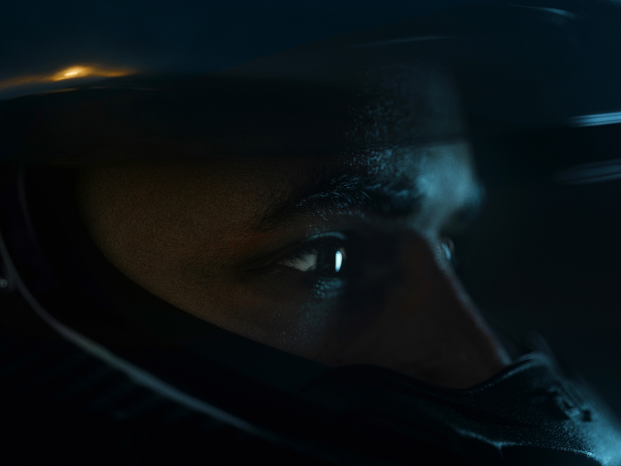
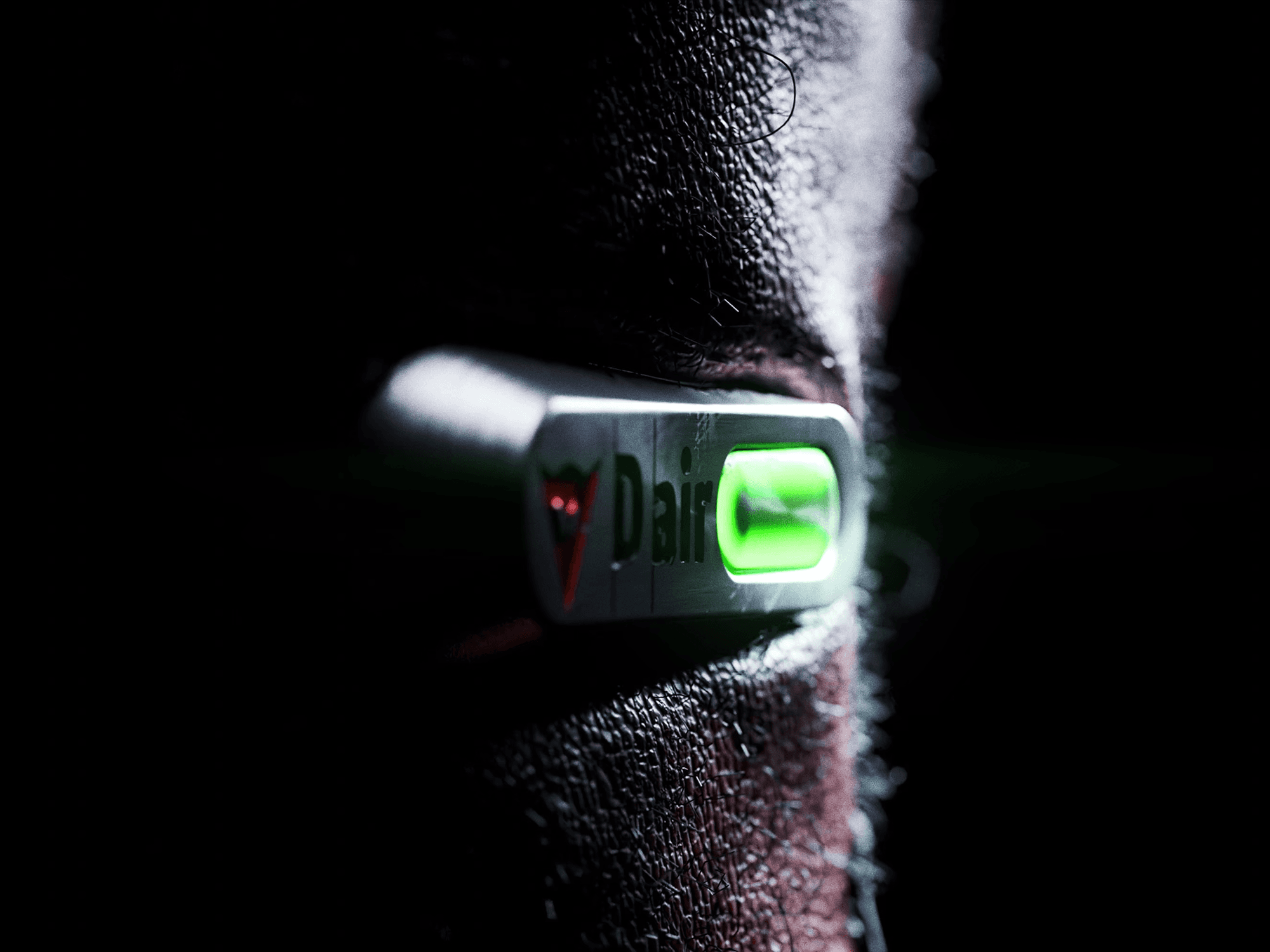
For Dainese, we created a cinematic visual narrative bringing the brand's bikes, gear, and more to life.
Directed, animated, and visualised with precision, the film explores materiality, light, and form, expressing the technical sophistication and identity of the Dainese brand.

We developed cinematic visuals exploring the brand's distinctive language of light, material, and form. Through precise digital visualisation and motion, the piece distils the sensual elegance and clarity that define the Tom Ford identity.
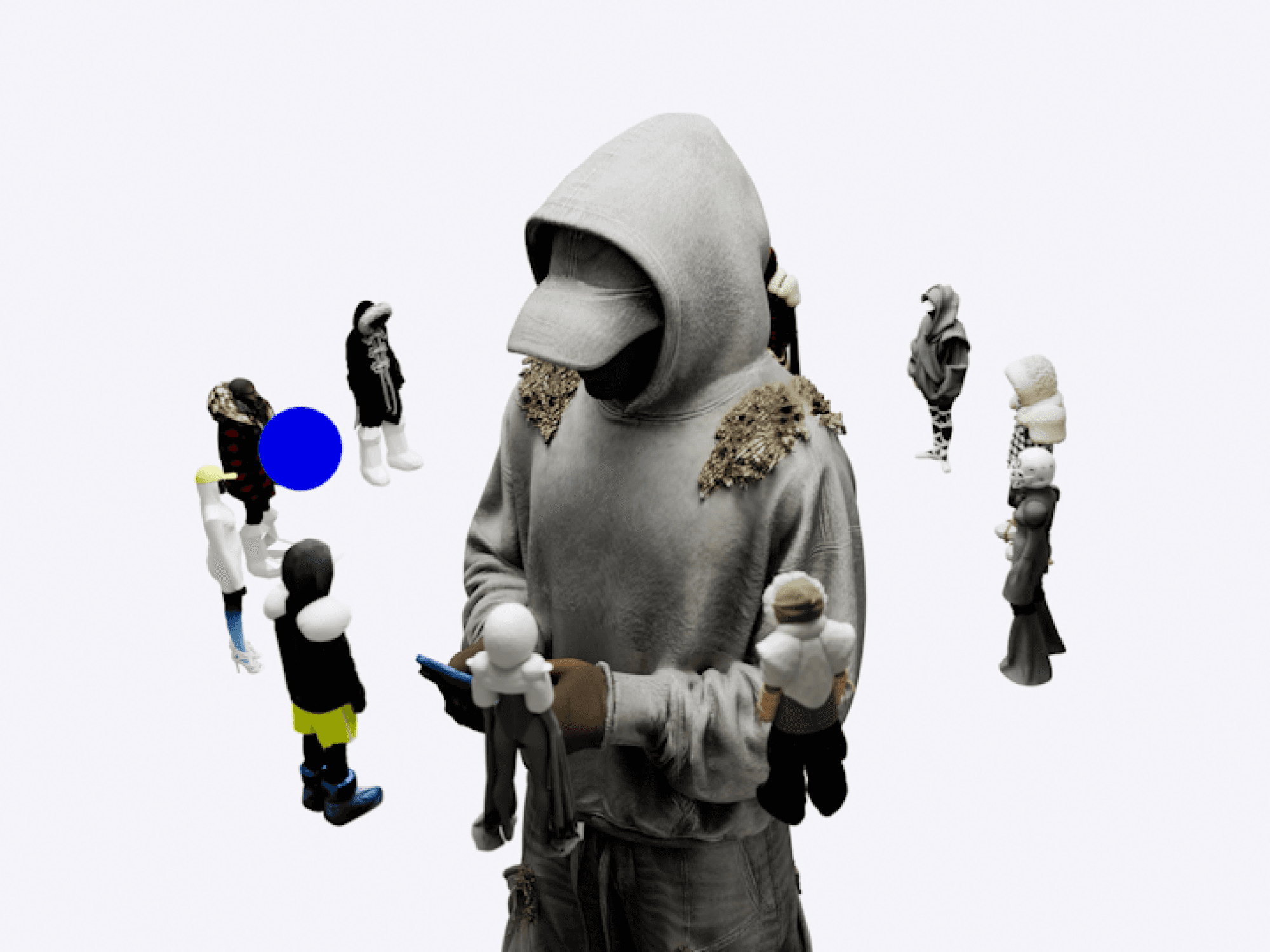
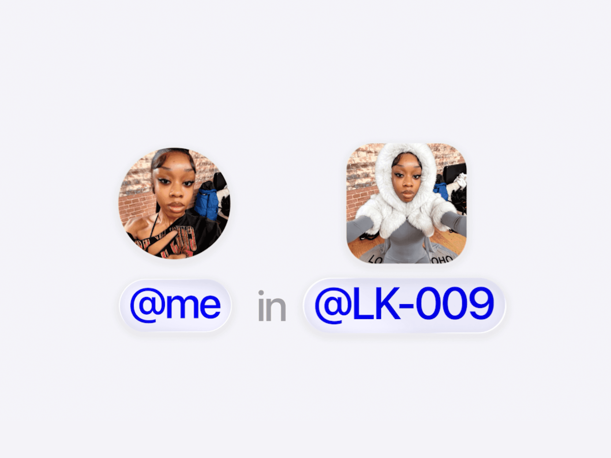
For Loho Kur, we brought a new collection and identity to life through cinematic animation, expressing his new collection code system and new direction.
Erosion is a sculptural footwear piece released through Zellerfeld.
Drawing inspiration from geological erosion, we designed, animated, and visualised the form, creating a fully digital-to-physical product.
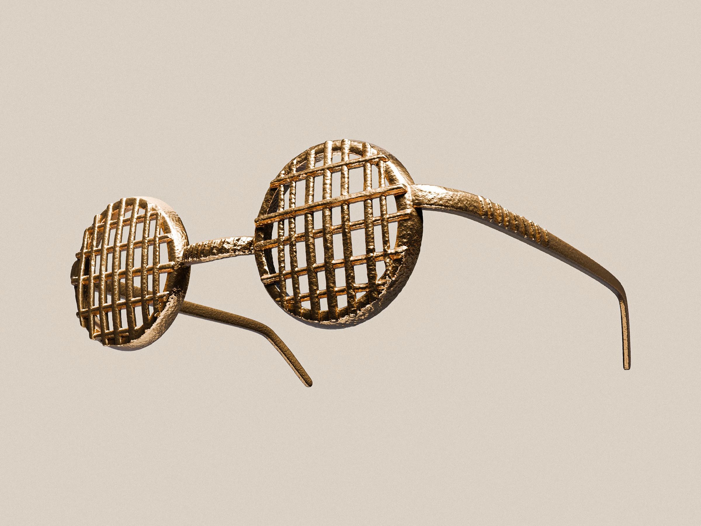
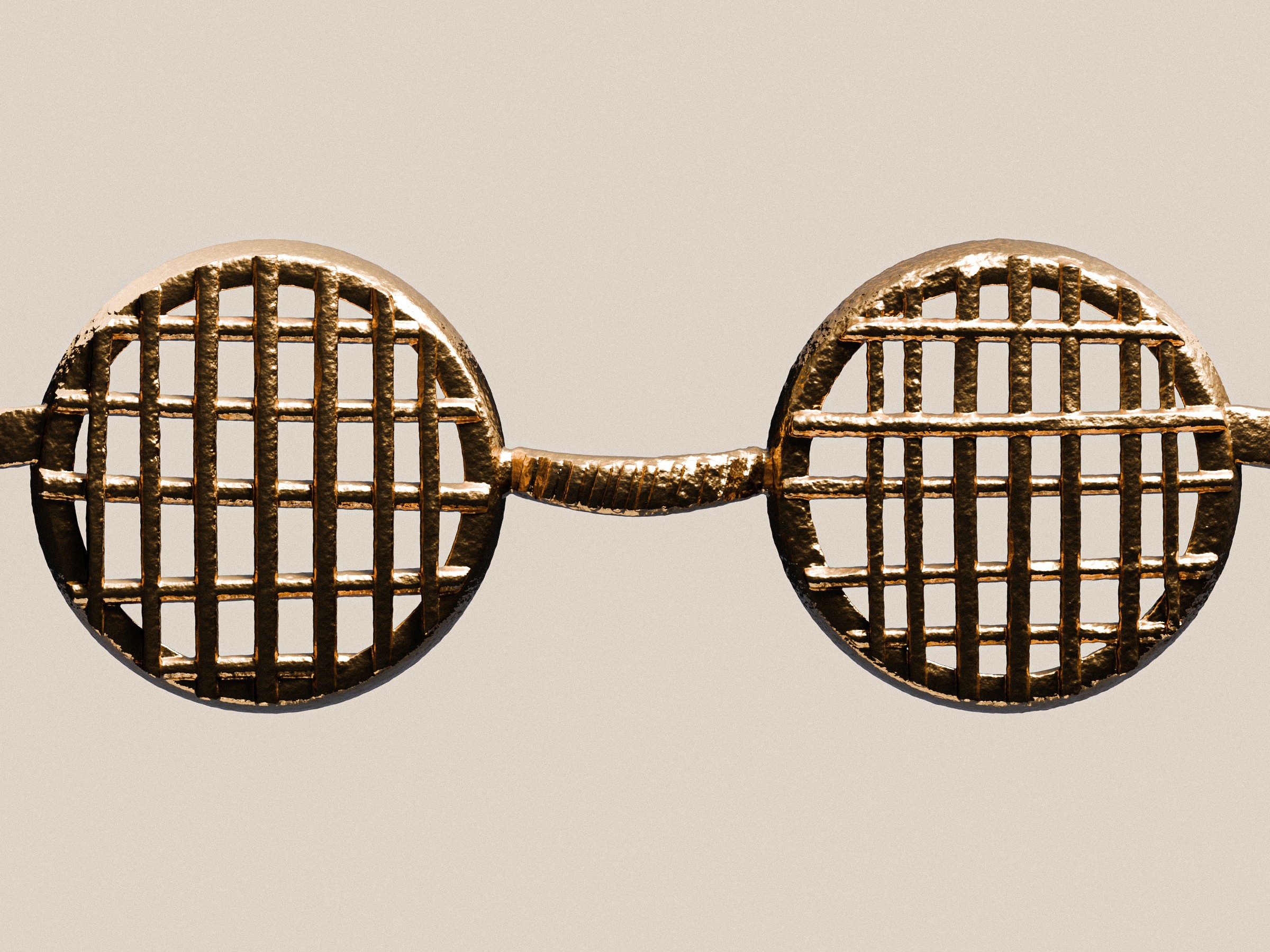
For Vic Mensa, we designed and engineered a one-of-one pair of gold Akan Chief glasses, precisely modelled to his head. The piece transforms heritage symbolism into a sculptural object, crafted as a powerful expression of personal identity.


For Sotheby's, we fully visualised a bespoke diamond grillz piece ahead of physical creation. The work translated the object into a precise digital asset, allowing the piece to be presented, communicated, and valued before it existed.
This process enabled a high-stakes sale environment with an estimated valuation of $3-5M, demonstrating how digital visualisation can shape perception and market value around rare objects.
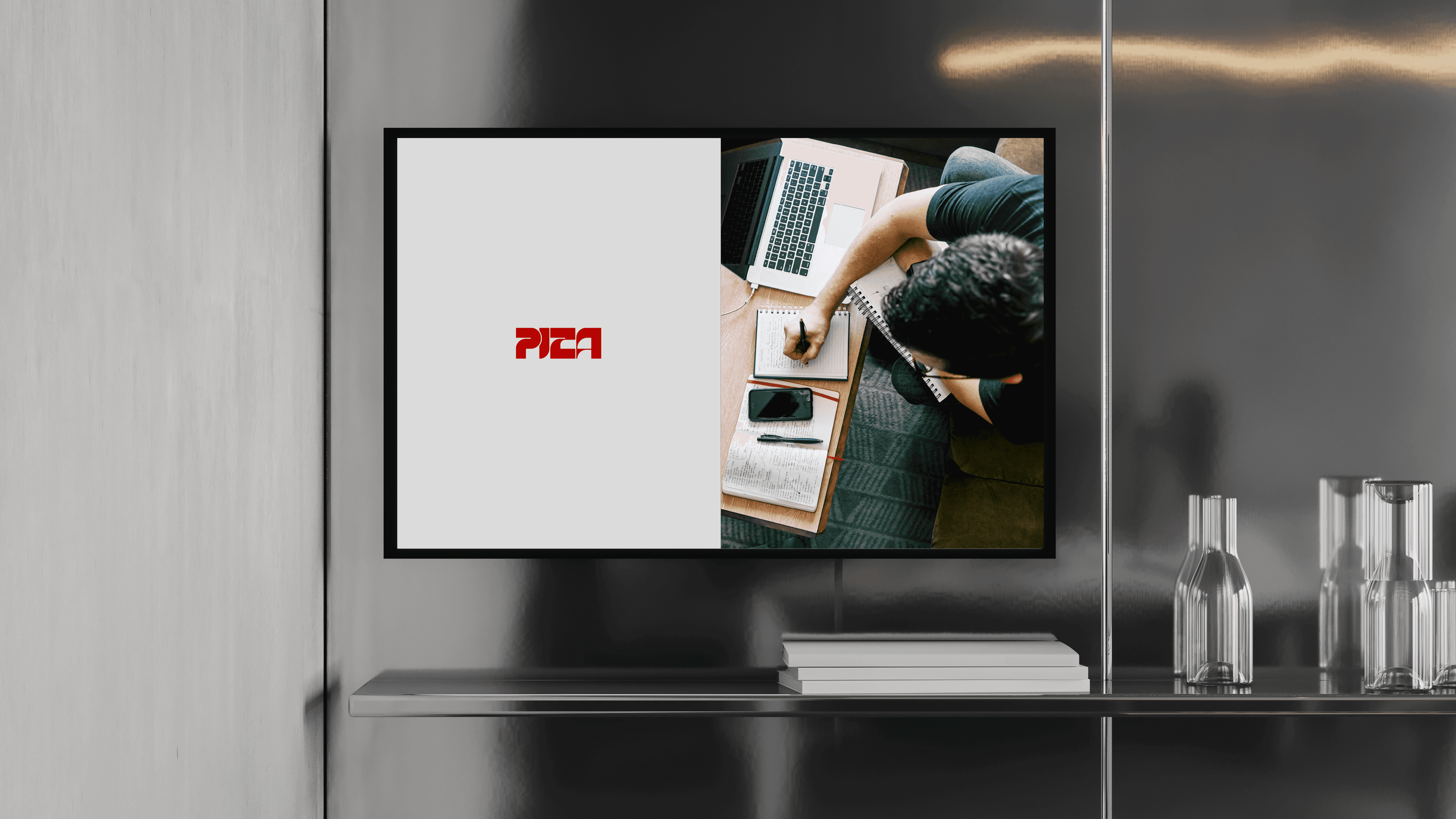


For PIZA, we built the full brand architecture - defining the strategic identity, typography, and visual systems. Designed as a unified structure, the brand projects clarity, confidence, and a commanding presence from launch.
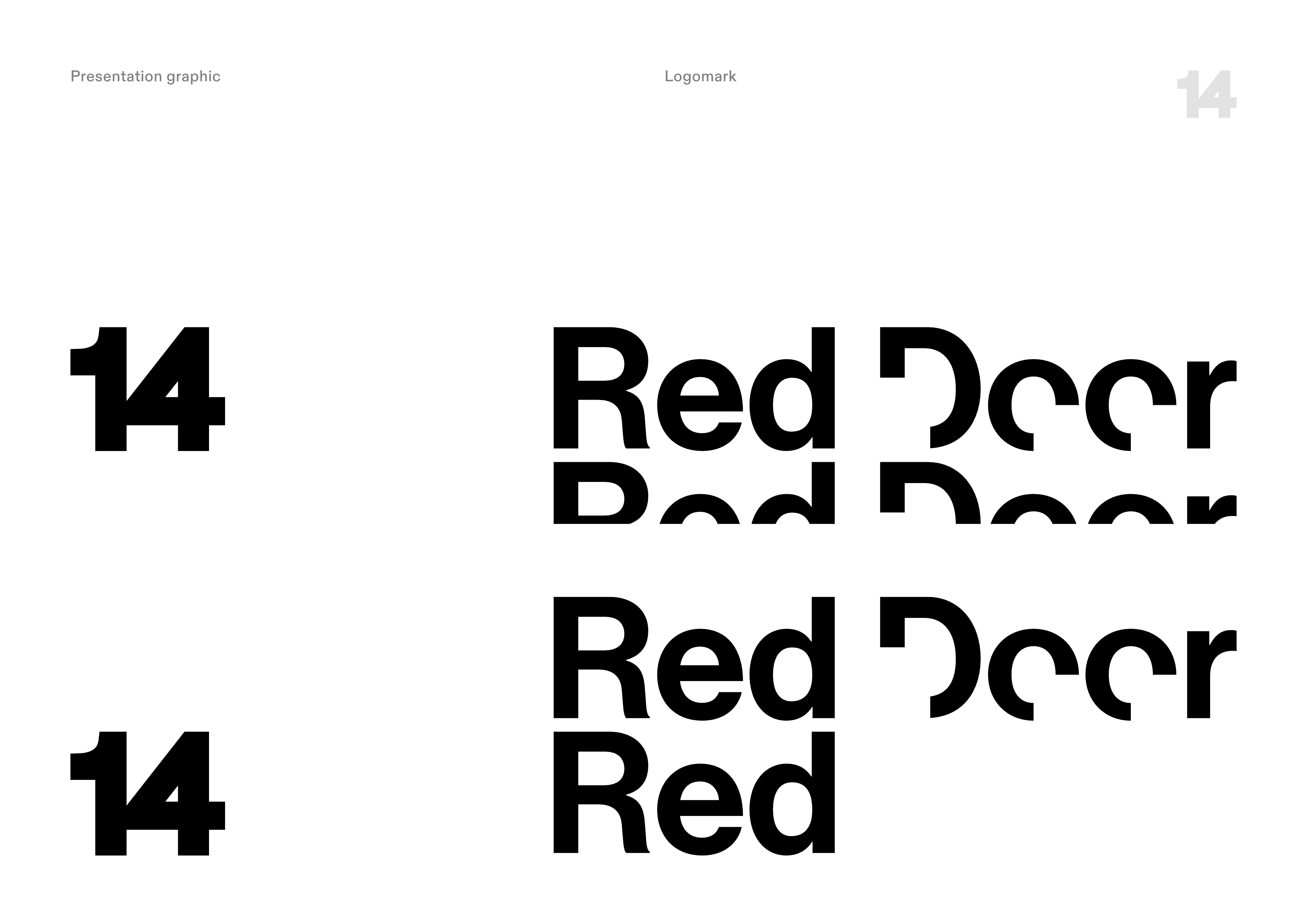
We created the complete identity for 14 Red Door - from naming and brand architecture to typography and visual language. Inspired by a fragmented childhood memory of a home long forgotten, the identity centres on the symbolism of a door: a threshold between the known and unknown, representing possibility an the idea that something powerful may exist beyond what is visible.